
Ernie Banks Baseball Cards: Values and Collector’s Guide
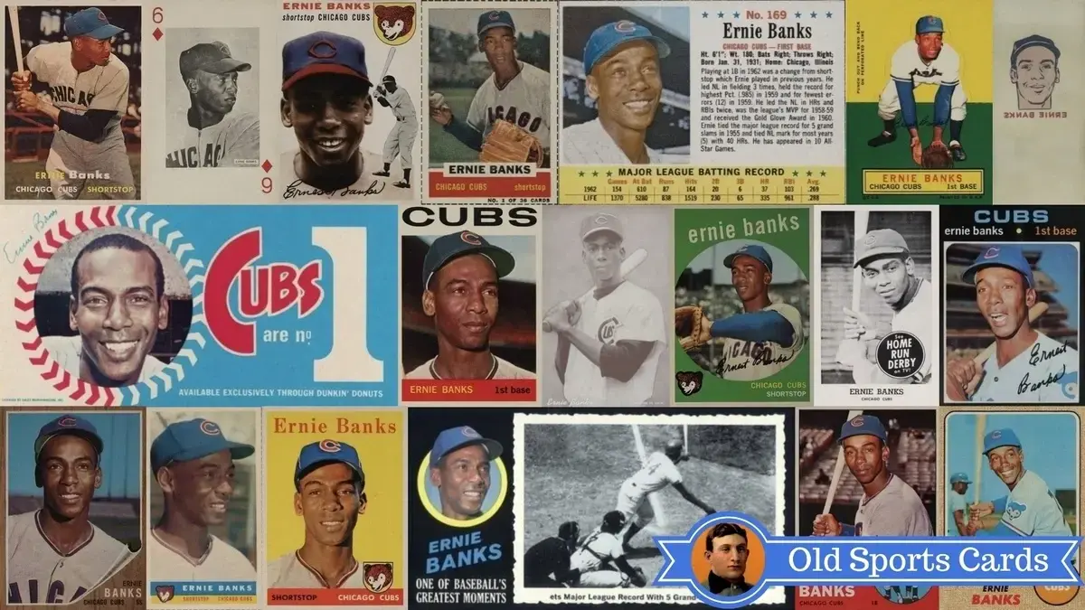
For Cubs fans and collectors, it doesn’t get much better than owning Ernie Banks baseball cards.
He was the greatest baseball player to ever wear a Cubs uniform.
His was the first number the Cubs ever retired.
He was “Mr. Cub”.
Because of his popularity with Cubs fans and his legendary status as one of the game’s true greats, Ernie Banks cards are some of the most popular in the hobby.
Below you’ll find a list of the key Banks cards that you’ll want to add to your collection.
Enjoy!
Let’s jump right in!
Player Bio
Position
Shortstop / First Baseman
Teams
Chicago Cubs
Career
1953–1971 (19 yrs)
Career Highlights
•14× All-Star
•2× NL MVP (1958, 1959)
•1960 Gold Glove Award
•2× NL home run leader (1958, 1960)
•2× NL RBI leader (1958, 1959)
•512 career home runs
•1977 Hall of Fame (first ballot)
•Chicago Cubs No. 14 retired
Card Universe
Most Valuable Card
1954 Topps #94 Ernie Banks Rookie Card
$35,000 in PSA 8
Most Graded
1954 Topps #94 Ernie Banks Rookie Card
6,514 graded by PSA
Most Affordable
1970 Topps #630 Ernie Banks
$175 in PSA 8
Need Help Selling Your Sports Cards?
Fill out the form below and I’ll get back to you within 24 hours. No obligation.

Ross Uitts – Owner
-
1954 Topps #94 Ernie Banks Rookie Card
Rookie CardPSA 8 Value $35,000Total PSA Population 6,514PSA 8 Population 146PSA 8 Grade Rate 2.2% (Set Avg: 11.4%)PSA Population Distribution
35357268491771550628914614212345678910This is the only recognized rookie card for Ernie banks and one of the keys to the 1954 Topps baseball card set along with the Hank Aaron and Al Kaline rookies.
It’s also one of the most valuable baseball cards in the entire hobby.
A large full color head shot of Banks dominates the front of the card while a nice black and white image of him ready at the plate flanks the right side.
The 1954 Topps design is a classic and instantly recognizable and it’s one of their best in my opinion.
Centering can be a challenge and the white background can easily show print defects.

-
1955 Bowman #242 Ernie Banks
PSA 5 Value $425Total PSA Population 1,522PSA 5 Population 210PSA 5 Grade Rate 13.8% (Set Avg: 12.5%)PSA Population Distribution
5612120425121020113146512345678910Bowman clearly put some creative thought into their 1955 set.
Photos of players are in borders that are meant to look like color TVs.
Berra has his bat over his shoulder, ready to hit whatever comes to him.
The only problem with the awesome TV borders is that the dark brown color chips so easily.
Only his last name “Berra” accompanies him on this card.

-
1955 Exhibits Ernie Banks
PSA 8 Value $800Total PSA PopulationPSA 8 PopulationPSA 8 Grade Rate 0.0% (Set Avg: 0.0%)
-
1955 Topps #28 Ernie Banks
PSA 8 Value $3,000Total PSA Population 4,997PSA 8 Population 176PSA 8 Grade Rate 3.5% (Set Avg: 10.3%)PSA Population Distribution
1433636199218116834121761812345678910In 1955 Topps would change to a horizontal layout and the result were some really sharp-looking cards.
Ernie’s card shows a nice, large head shot of him along the right with a nice action shot of him crouched and ready at the shortstop position.
The red background really gives this card some great eye appeal.
The Koufax, Clemente and Killebrew rookies are the most sought after in the 1955 Topps set but Banks’ card is still a key.

-
1955 Topps Doubleheaders #31-32 Ernie Banks
PSA 8 Value $800Total PSA PopulationPSA 8 PopulationPSA 8 Grade Rate 0.0% (Set Avg: 0.0%)
-
1956 Topps #15 Ernie Banks
PSA 8 Value $1,500Total PSA PopulationPSA 8 PopulationPSA 8 Grade Rate 0.0% (Set Avg: 16.1%)Back with another horizontal design in 1956, Topps went with pretty much the same head shot of Banks on the right, less some difference in coloring of his jersey.
You’ll find that Topps re-used player images more than once on cards throughout the 1950’s and 1960’s.
It doesn’t make the card any less desirable, though, as the overall design is finished off by a nice image of Banks being congratulated at home plate.
Centering is usually the most common challenge with this card.
-
1957 Topps #55 Ernie Banks
PSA 8 Value $1,250Total PSA Population 4,633PSA 8 Population 273PSA 8 Grade Rate 5.9% (Set Avg: 19.5%)PSA Population Distribution
7122444074175594163727338112345678910To some collectors, the 1957 Topps set is their favorite Topps set of the 1950’s since it was the first time they used color photography for player images.
Here Banks is shown ready at the plate in his famous batting stance.
The Brooks Robinson, Frank Robinson, and Don Drysdale rookies may be the key rookie cards of the set but Banks’ card is also a key to to this iconic set.
Watch out for poor centering on this card.

-
1958 Topps #310 Ernie Banks
PSA 8 Value $800Total PSA Population 3,323PSA 8 Population 255PSA 8 Grade Rate 7.7% (Set Avg: 16.9%)PSA Population Distribution
631793125784995524362552412345678910Ernie Banks’ 1958 Topps card really stands out from the pack due to its bright yellow background.
That coloration instantly gives this card some nice pop.
Series 1 cards in this set are notorious for featuring variations in the color of a player’s name but since Banks’ card is #310 he only has the one you see below.
The yellow background, while beautiful, can be prone to showing print defects.
Banks played fantastic baseball in 1958 leading the league in home runs and RBI on his way to his first of two consecutive MVP awards.
-
1959 Bazooka Ernie Banks
ValueTotal PSA PopulationPopulation 0Grade Rate 0.0% (Set Avg: 0.0%)
-
1959 Home Run Derby Ernie Banks
ValueTotal PSA PopulationPopulation 0Grade Rate 0.0% (Set Avg: 0.0%)
-
1959 Topps #350 Ernie Banks
PSA 8 Value $800Total PSA Population 4,745PSA 8 Population 451PSA 8 Grade Rate 9.5% (Set Avg: 23.7%)PSA Population Distribution
6018945372872285773145155412345678910To round out the 1950’s, Topps released a design with encircled player images and slanting player names in their 1959 set.
I think it’s one of their more creative designs in the 1950’s and the Ernie Banks card is a really nice example.
The green background is a nice compliment to the fantastic shot of Banks waiting to catch the ball.
Banks would win his second and final MVP award that year.
-
1960 Bazooka #1 Ernie Banks
ValueTotal PSA PopulationPopulation 0Grade Rate 0.0% (Set Avg: 0.0%)
-
1960 Baooka #1 Ernie Banks
ValueTotal PSA PopulationPopulation 0Grade Rate 0.0% (Set Avg: 0.0%)
-
1960 Topps #10 Ernie Banks
ValueTotal PSA PopulationPopulation 0Grade Rate (Set Avg: 0.0%)PSA Population Distribution
10129853992580573649524319123456789101960 was the only year in which Topps went with a horizontal layout for its baseball card sets.
A black and white image of Banks atop a yellow background drapes the left while a nice full color head shot of him dominates the right side.
The split pane design was a nice creative step forward and one of the most easily recognized designs of the 1960’s.
The 1960 Topps Ernie Banks card usually suffers from poor centering and at time print defects will creep into the green background along the bottom.

-
1960 Topps Tattoos Ernie Banks
ValueTotal PSA PopulationPopulation 0Grade Rate 0.0% (Set Avg: 0.0%)
-
1961 Topps #350 Ernie Banks
PSA 8 Value $350Total PSA Population 3,802PSA 8 Population 505PSA 8 Grade Rate 13.3% (Set Avg: 28.1%)PSA Population Distribution
191032345075396747475055712345678910This is one of Ernie Banks’ easiest cards to find in high grade as Topps had far fewer print quality concerns that year compared to others.
The image that Topps chose isn’t as exciting as those that they chose in previous years and I think that’s primarily what holds this one back from being as desirable.
Serious Banks fans will pay no attention to that, though, as they love it all the same.
Print dots can show up in the bottom colored border and centering is also an issue at times.
The injury bug caught up with Banks in 1961 as he started to spend time in left field and at first base due to knee problems.
-
1961 Seven Eleven #23 Ernie Banks
ValueTotal PSA PopulationPopulation 0Grade Rate 0.0% (Set Avg: 0.0%) -
1962 Pittsburgh Exhibits Ernie Banks 6 of Diamonds
ValueTotal PSA PopulationPopulation 0Grade Rate 0.0% (Set Avg: 0.0%)
-
1962 Topps #25 Ernie Banks
PSA 8 Value $725Total PSA Population 3,444PSA 8 Population 246PSA 8 Grade Rate 7.1% (Set Avg: 20.9%)PSA Population Distribution
21712205305067236802462312345678910The famous wood grain borders of the 1962 Topps baseball cards are instantly recognizable on this Ernie Banks baseball card.
While those borders can show wear and chipping rather easily, the nice full image of a smiling Banks makes this a great card overall.
Because of the aforementioned condition issues, this is also one of his more expensive cards of the 1960’s, too.
His position is listed as shortstop but by that time he was a full-time first baseman.
-
1963 Jell-O #169 Ernie Banks
ValueTotal PSA PopulationPopulation 0Grade Rate 0.0% (Set Avg: 0.0%) -
1963 Topps #380 Ernie Banks
PSA 8 Value $575Total PSA Population 2,279PSA 8 Population 250PSA 8 Grade Rate 11.0% (Set Avg: 28.8%)PSA Population Distribution
12431233073354834762502912345678910In my opinion, the 1963 Topps design was their most creative in the 1960’s.
The dual-image approach with the smaller one being superimposed and encircled along the bottom were a great concept.
Banks stands ready at the bat and looking rather serious compared to other cards in the paSt. Centering and chipping along the colored bottom border are major challenges for this card.
For the first time since 1954, Ernie Banks would not make the All-Star team that season.
-
1964 Topps #55 Ernie Banks
PSA 8 Value $675Total PSA Population 3,047PSA 8 Population 240PSA 8 Grade Rate 7.9% (Set Avg: 29.3%)PSA Population Distribution
25982734984966934952403012345678910This is probably the easiest Banks card to find in top condition because Topps had terrific printing quality that year.
If anything, you may find some centering issues here and there but compared to other years it’s not as tough.
A nice image of Banks smiling and looking off into the distance gives the card a classic and straightforward appearance overall.
Banks put up very respectable numbers that year but still didn’t quite make the All-Star team.
-
1964 Topps Stand-Up Ernie Banks
ValueTotal PSA PopulationPopulation 0Grade Rate 0.0% (Set Avg: 0.0%) -
1965 Topps #510 Ernie Banks
PSA 8 Value $400Total PSA Population 2,725PSA 8 Population 447PSA 8 Grade Rate 16.4% (Set Avg: 33.2%)PSA Population Distribution
288216131035848455544768912345678910Sometimes Topps went with puzzling player images on vintage baseball cards and I think this is one of those instances.
The card still looks nice but it would’ve been way better had they taken his picture from the front.
The red border and Cubs pennant in the lower left a very nice touches.
Those red borders are prone to showing print blotches and centering can be an issue, too.
Banks would once again be selected as an All-Star in 1965.
-
1966 Topps #110 Ernie Banks
PSA 8 Value $400Total PSA Population 2,972PSA 8 Population 308PSA 8 Grade Rate 10.4% (Set Avg: 29.0%)PSA Population Distribution
5111827248346650637930836512345678910The 1966 Topps design was fairly straightforward and featured a nice full head shot of Banks with a bright blue sky in the background.
I think it would have been even better had they used red instead of orange in the upper right and bottom borders.
But, still, a great-looking card overall.
That year, Banks would hit the fewest home runs (15) since 1954 but he still managed to knock in 75 RBI.
-
1967 Topps #215 Ernie Banks
PSA 8 Value $350Total PSA Population 3,430PSA 8 Population 580PSA 8 Grade Rate 16.9% (Set Avg: 34.2%)PSA Population Distribution
368019842540562160358082212345678910This card really has great eye appeal and a great vibe overall.
The bright smile on Banks’ face and bright blue background really make this card standout.
The facsimile signature is also a nice touch.
He had another great year in 19
-
1967 Venezuela Topps #275 Ernie Banks
ValueTotal PSA PopulationPopulation 0Grade Rate 0.0% (Set Avg: 0.0%) -
1968 Topps #355 Ernie Banks
PSA 8 Value $250Total PSA Population 3,826PSA 8 Population 723PSA 8 Grade Rate 18.9% (Set Avg: 29.6%)PSA Population Distribution
261142164334525976727231812712345678910Opinions are usually mixed on the 1968 Topps design with its burlap-colored borders but how can you not love this Ernie Banks card?
His beaming smile is hard to beat and really makes it one of his best-looking of the 1960’s in my opinion.
He must’ve been feeling good that year because it was the first time since 1962 that he would put up more than 30 home runs after belting 32 in total.
Condition issues like centering and print defects aren’t as big of a challenge as usual but wear and chipping easily show on the non-white borders.
-
1969 Dunkin Donuts Cubs Bumper Stickers Ernie Banks
ValueTotal PSA PopulationPopulation 0Grade Rate 0.0% (Set Avg: 0.0%)
-
1969 Topps #20 Ernie Banks
PSA 8 Value $275Total PSA Population 4,412PSA 8 Population 828PSA 8 Grade Rate 18.8% (Set Avg: 32.0%)PSA Population Distribution
381322655595316606918283181712345678910Here was another instance where Topps used the same image of Banks in consecutive years but who cares?
It made for a great-looking card in 1968 so why wouldn’t it in 1969?
Tilt is a famous concern on 1969 Topps baseball cards but if you can locate one without tilt and nicely centered then you’ve got a nice card on your hands.
The orange circle with name and position info along with the Cubs name in yellow on the bottom are great touches.
1969 was an important year for Banks as it would be his last of 11 career All-Star selections and the last time he put up more than 100 RBI with 106 total.
-
1970 Topps #630 Ernie Banks
PSA 8 Value $175Total PSA Population 2,917PSA 8 Population 691PSA 8 Grade Rate 23.7% (Set Avg: 39.2%)PSA Population Distribution
84410128632745466869198312345678910I go back and forth on whether I like the 1970 Topps design or not.
It’s definitely not my favorite vintage baseball card design but it’s certainly unique, I’ll give it that.
The grey borders can easily show wear and centering was definitely a challenge for these cards.
An older Banks on the tail end of his career is shown swinging the bat with the big bright smile of his.
-
1971 Topps Greatest Moments #36 Ernie Banks
ValueTotal PSA PopulationPopulation 0Grade Rate 0.0% (Set Avg: 0.0%)
-
1971 Topps #525 Ernie Banks
PSA 8 Value $900Total PSA Population 2,487PSA 8 Population 247PSA 8 Grade Rate 9.9% (Set Avg: 33.7%)PSA Population Distribution
8351323763915085912476112345678910I’m not sure what to call the expression on Ernie’s face on his 1971 Topps baseball card but I love the card anyway.
To me, the 1971 Topps design is one of the best, if not the best, card designs of the 1970’s.
The black borders were an aggressive step forward and they do easily show wear, but in top condition these cards have strong appeal.
T he 1971 Topps Ernie Banks card looks classic but still has a warm feel to it.
In Banks’ last season, he would appear in only 39 games and hit only .193.
Clearly he was finished but what an amazing career he had and what an amazing card to cap off his career.

Ross’s Take
So there you have it, the full list of the most important Ernie Banks cards that you should add to your collection.
Banks is an icon for both the Chicago Cubs and the entire game of baseball.
After a brief stint in the Negro Leagues and military service, Banks finally got his chance to shine in the Majors when the Cubs bought his contract from the Kansas City Monarchs.
And the rest was history.
Sadly, Banks never got to compete in post season play during his career but that didn’t prevent him from playing the game with joy and a positive disposition.
A great example for all ball players, really.
Inducted into the Baseball Hall of Fame in 1977, his positive approach and optimism forever ring true with his famous line of: “There’s sunshine, fresh air, and the team’s behind us.
Let’s play two.”